I have some charts that need have a roughly 1:1 aspect ratio of width to height. I could specify the height and width exactly, however this would mean that the chart would not resize itself for different screen sizes.
Is there a way to specify the aspect ratio of the chart, without having to set an exact height and width?
Apologies that this post fell a bit in between. Thanks for the reminder!
At the moment, everviz doesn’t have a built-in way to lock the aspect ratio (like 1:1) for responsive charts. By default, the embed sets a fixed height (around 400–500 px), which means it scales in width but not height.
If you’d like your chart to stay perfectly square and responsive, you can use this CSS workaround. It works with the default iframe embed. (I was not able to get it to work with script embed).
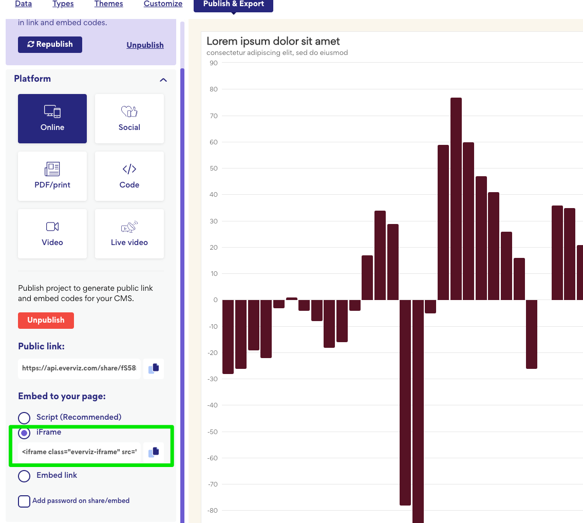
The Iframe is what you get when you copy the embed from everviz. You’ll need to add the wrapper around it.
CSS (add this in your CMS Custom CSS area)
/* Responsive square wrapper */
.evz-1-1 {
  position: relative;
  width: min(100%, 640px);   /* max 640px wide, adjust as you like */
  aspect-ratio: 1 / 1;       /* keep it square */
  margin-inline: auto;       /* center horizontally */
}

/* Force everviz iframe to fill the wrapper */
.evz-1-1 > .everviz-iframe {
  width: 100% !important;
  height: 100% !important;
  max-height: none !important;
  border: 0;
  display: block;
}

/* Optional: keep full width on small screens */
@media (max-width: 640px) {
  .evz-1-1 { width: 100%; }
}
Once this CSS is added, any everviz iframe wrapped in <div class="evz-1-1"> … </div>
will automatically maintain a 1:1 aspect ratio and scale smoothly across screen sizes.
We realize this is a bit of a workaround for now, but it’s a reliable fix until we can explore adding aspect ratio control directly inside everviz. Thanks again for bringing this up. Really helpful feedback!