I have a group of items with different effective dates for different periods of time. I am looking to create a chart comparing these items and their timeframes. I’m having trouble getting the dates to appear correctly. Perhaps, I am not formatting the columns properly?
Does anyone have an example of a chart that might compare timeframes using month, day and year data for the dates?
I can’t get the full date to appear - such as: 6/1/2024.
Thank you for any help anyone has to offer! Would be happy to see any Everviz examples of charts comparing things over annual timeframes. Apologies I am pretty new to this. And I didn’t see anything like this in the Everviz sample charts.
Thank you for this example. Looking closer at it, I think the challenge with using this chart (Annual weather averages in Canada - Column chart - everviz) - is that the “Categories” are the months of the year. I need to create a chart where the “Categories” are a list of rules and proposals and the date field would show the different implementation and finalization dates.
Thank you though! Appreciate the help.
Thanks,
Laurie
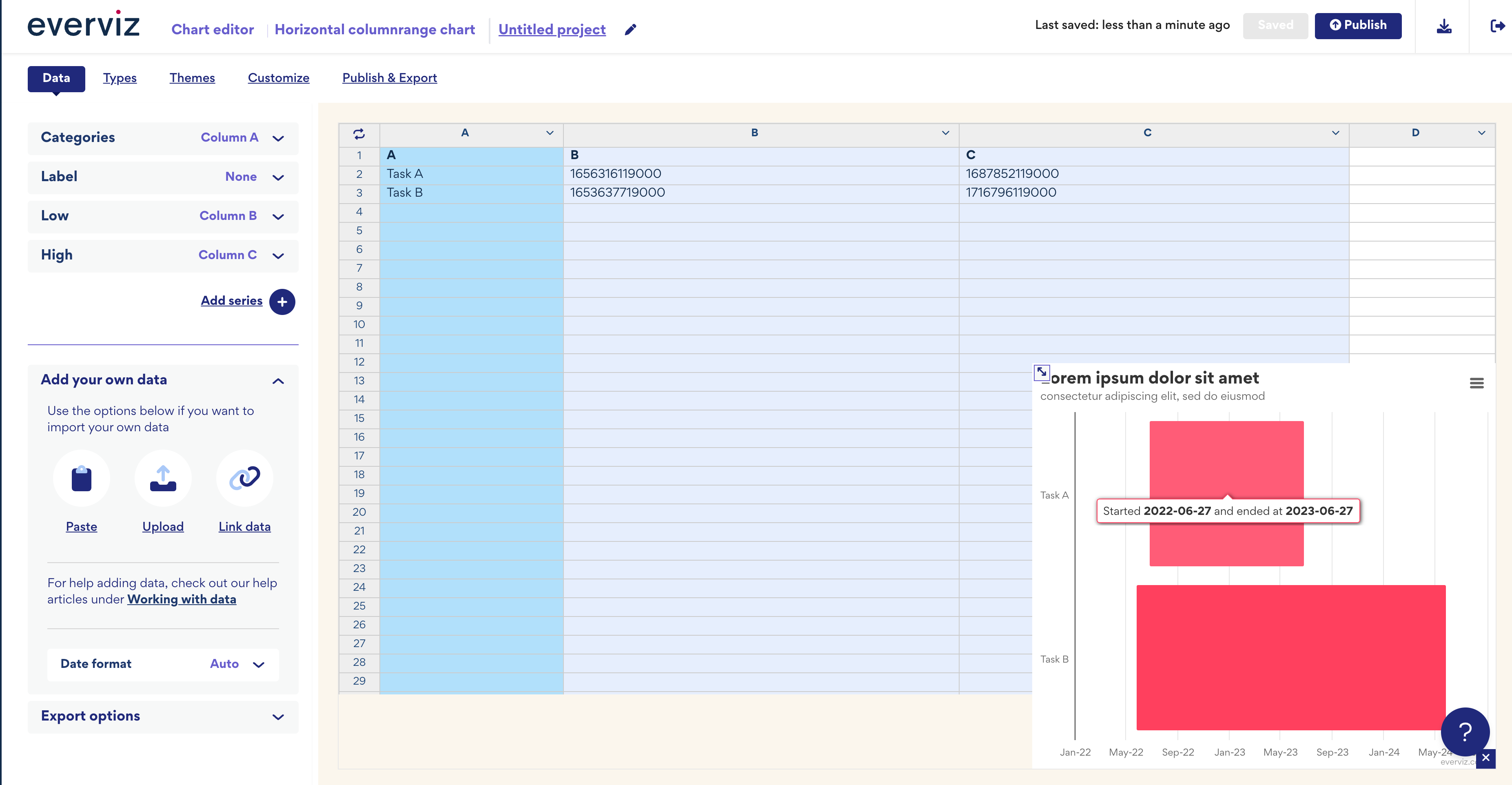
Thanks for the additional information. While we don’t support this feature out of the box, I’ve created a proof of concept that might meet your needs.
The tricky part is setting the dates in milliseconds, as this is what our underlying rendering platform uses. This means you would need to convert dates in your Excel file to milliseconds before uploading to everviz.
Thank you again. I found a way online to convert the date to milliseconds. And I am re-using your Proof of Concept chart.
As I customize this, I want the Data (the Date) in Column B to display as a green color and I want the Data (different Date) in Column C to display in a different color.
So, the Green = Finalized rules date and the Blue = Compliance Date.
I am not sure this is possible. I might just make 2 different charts for the different dates.
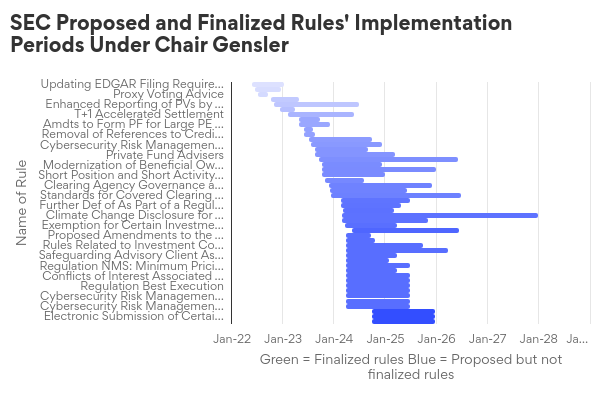
I’m noticing some of the data isn’t getting displayed.
Some of the “Name of Rules” text in Column A is getting cut-off. Is there a way I can allow users to see all of the text?
And, also some data is missing. For example, in the Data, Column A - Row 13: “Regulation NMS: Minimum Pricing Increments, Access Fees, and Transparency of Better Priced Orders” is not displaying at all in the chart.
Regarding the text cut-off, our rendering engine, Highcharts, tries to balance showing enough text without compromising the visual and ensure responsiveness. This is why it cuts off the text and shows an ellipsis (…). If you hover over the label, the full text will appear. Some items have quite a lot of text; could you shorten them?
As for displaying the lines, this is also related to responsiveness. There are many rows, so I recommend increasing the chart height to show more rows. You can adjust this under Appearance Styles > Chart Height, setting it to, for example, 1000.
It appears the share link doesn’t account for the height setting, so please test the chart on your CMS to ensure it looks correct or see it in fullscreen view using the embed link: everviz
Thanks so much, Havard. We’ve worked our way through the chart and have just one question remaining. We would like to label different rows of data with different colors. We see the option to create new data series for columns, and assign unique columns to them. But we do not see the option to differentiate data series within the same columns. Is that possible?