Scatter Chart

Hey all, long time no see.

I’m looking to create the following scatter chart, but I’m lost how I can format my data to fit.

Here is my data:

Metro Emp_LQ Wage_LQ
Atlanta 0.98 1.05
Austin 1.26 1.15
Baltimore 1.1 1.1
Chicago 0.73 0.91
Cinncinati 0.91 1.03
Cleveland 0.73 0.79
Dallas 1.12 1.14
Denver 1.24 1.15
Detroit 0.81 0.94
Houston 1.36 1.38
Indianapolis 1.13 1.31
Las Vegas 1.32 1.46
Los Angeles 0.78 0.75
Louisville 0.97 1.03
Miami 1.06 0.92
Milwaukee 0.88 1.05
Minneapolis 0.85 1.01
New York 0.74 0.64
Omaha 1.27 1.37
Phoenix 1.44 1.5
Pittsburgh 0.93 1.01
Portland 1.23 1.27
Raleigh 1.39 1.35
Salt Lake City 1.31 1.23
San Antonio 1.16 1.3
San Diego 1.12 1.02
San Francisco 0.93 0.69
Seattle 1.08 0.78
Spokane 1.05 1.07
Tampa 1.24 1.12

Hi Chris,

Thanks for reaching out. You can create a chart similar to this sample chart by following this steps.

  1. Create a Basic Scatter chart in everviz and open it in the chart editor
  2. Go to the data section select the full data and paste your data in the data grid
  3. from the left section Select Column B for Category from dropdown
  4. for series 1 select Column C for Value and Coulmn A as Label
  5. remove the series 2
  6. from the Customize → Data Labels → Label style you cant update the label font size and other style.
  7. you can use line annotation for the diagonal line
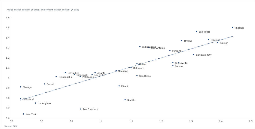
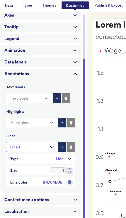
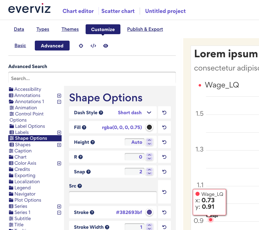
  8. If you want Line annotation as Diagonal line appear as shortdot style then navigate to Customize → Advanced ->Annotation 1 → Shape Options and update the Dash Style

Following these steps should help you create the chart you’re aiming for. Let me know if you have any further questions.

Best Regards,
Faria

Thanks @far

I’m not sure if I’ve done anything wrong, but at point 4, I only see the following

Hi Chris,

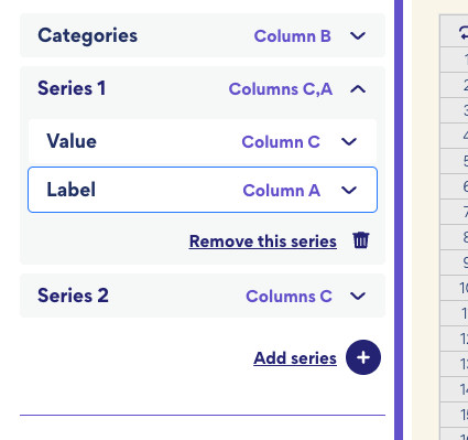
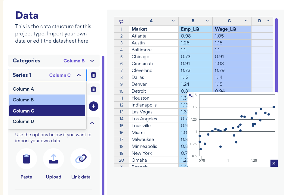
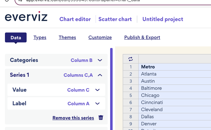
You’re on the right track! At step 4, you just need to update two properties Of Series 1:

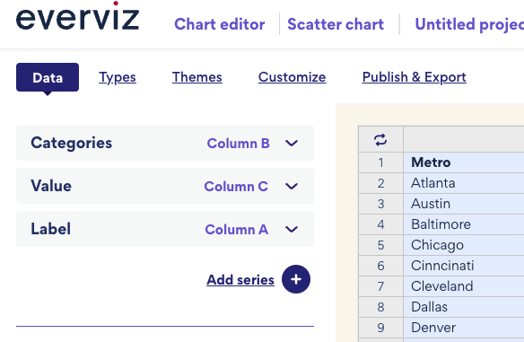
  • Set Column C as the Value
  • Set Column A as the Label

From your screenshot, it looks like you’ve correctly selected Column C as the value. Now, simply close the Value dropdown and select Column A for the label.

Once that’s done, you can proceed to step 5.
Let me know if you run into any issues!

Best regards,
Faria

Hey Faria,

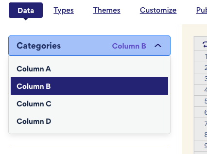
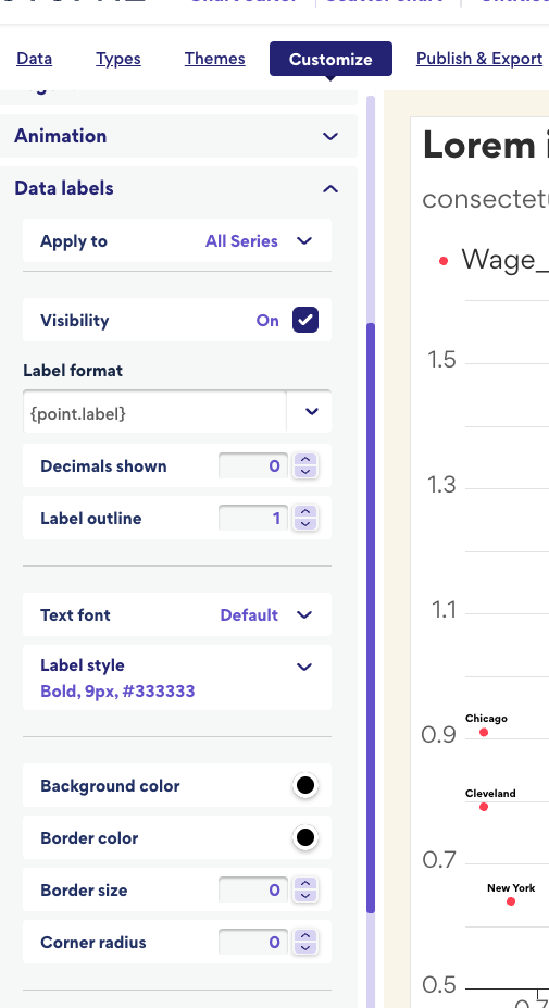
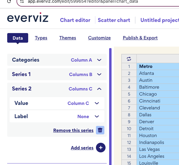
When I click on the down arrow for Series 1, I don’t have the option to choose a value and label. it just give me the option to choose a different column for series 1

Hi Chris,

Did you follow the exact steps I mentioned from 1 to 4, or did you make any other changes along the way? On my end, both options are appearing as expected.

You can try an alternative approach:You can try another way first try 1 to 3 steps, then move to step 5 first remove series 2


Then there should be only category, Value, and Label.

Let me know how it goes or if you’re still having trouble.

Best,
Faria