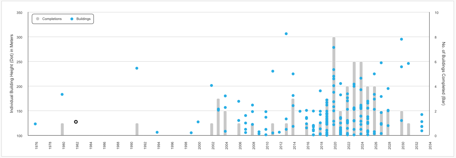
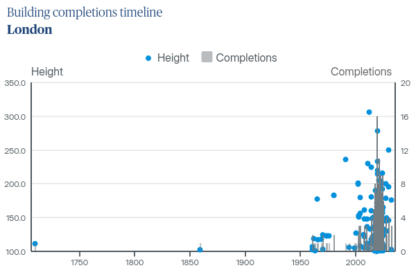
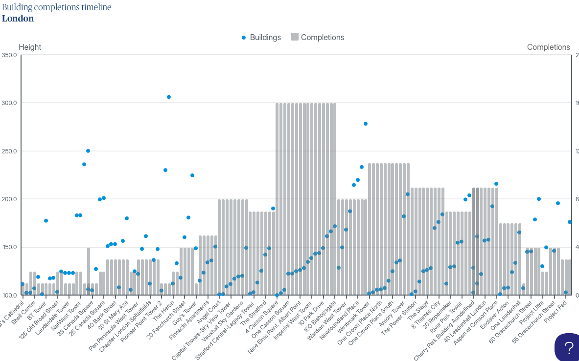
On the Y-axis (left) is Hight of buildings (which correlate with the X-axis of the year they were completed)
On the Z-axis (right) is number of completions per year
Here is where I get to:
When I save and leave the chart and come back to it, my columns seem to disappear and i can’t see how to get them back (the series still appears in the legend)
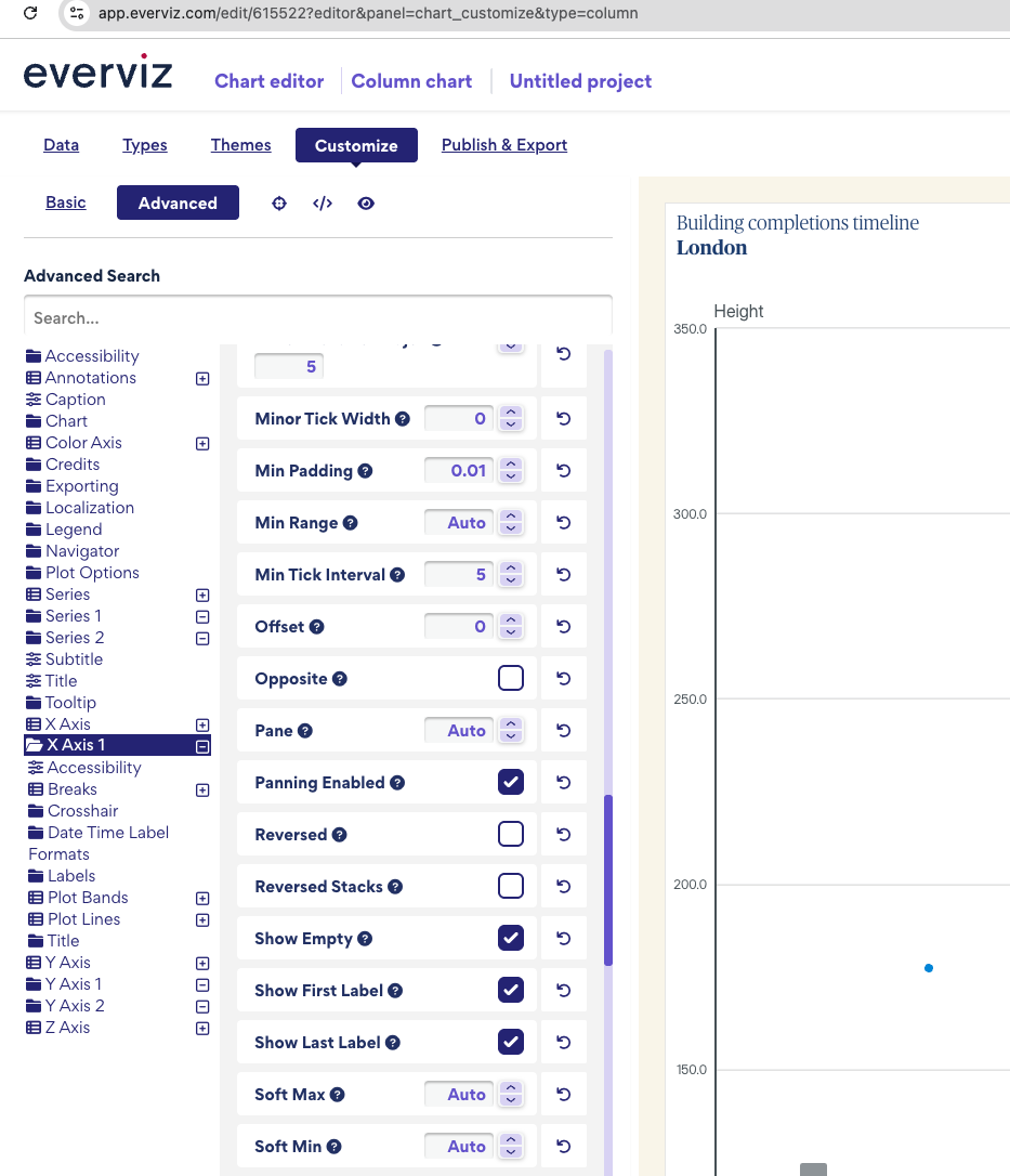
Also, my X-axis is set to date/time but I don’t want it to show every year between the 1710 and 2032, as my data is heavily bunched to the right.
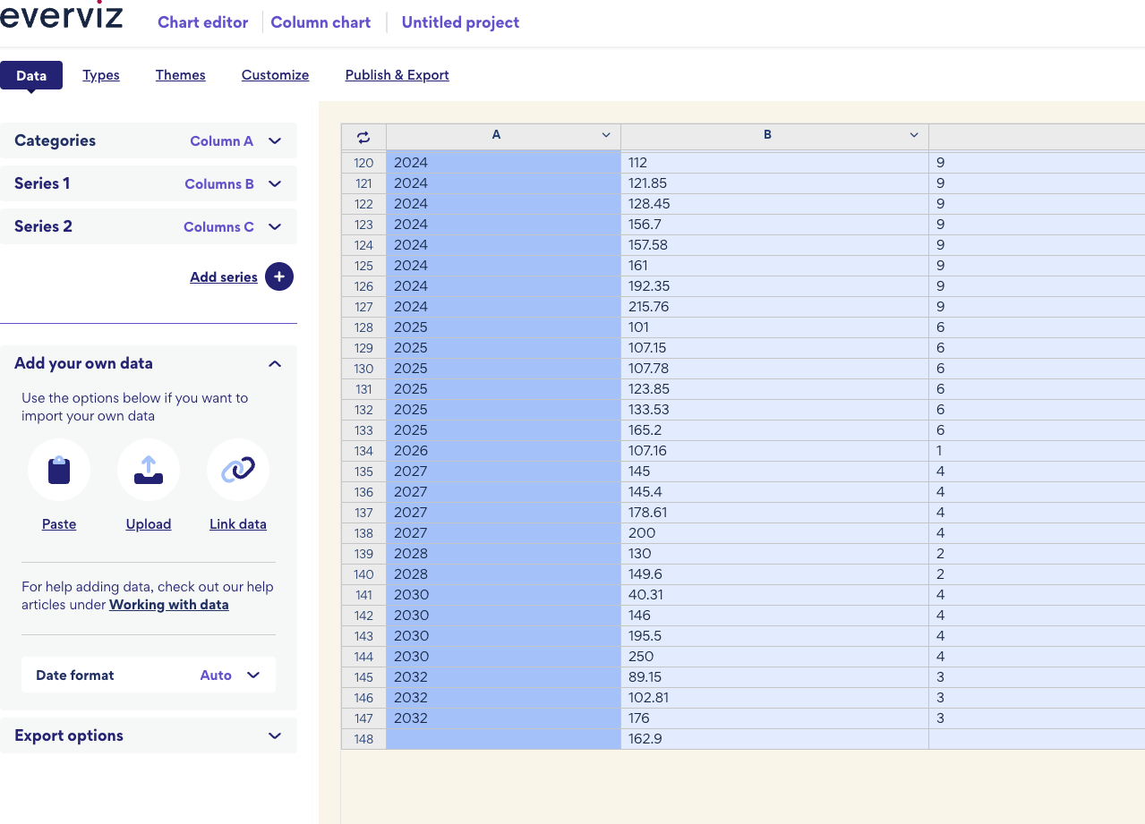
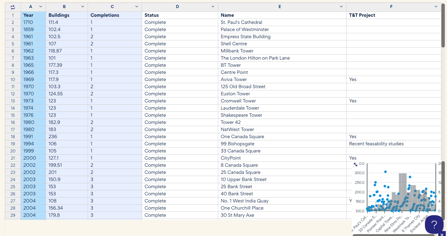
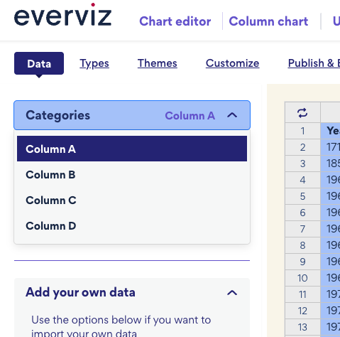
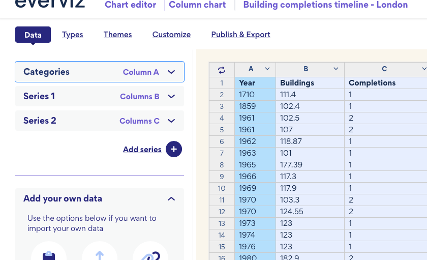
I found the reason why the column was disappearing. In the data section, the last row contains a value for Height but does not include a value for Category . Because of this invalid entry, the column was not displayed. Please remove that row. After removing it, the chart appears correctly:
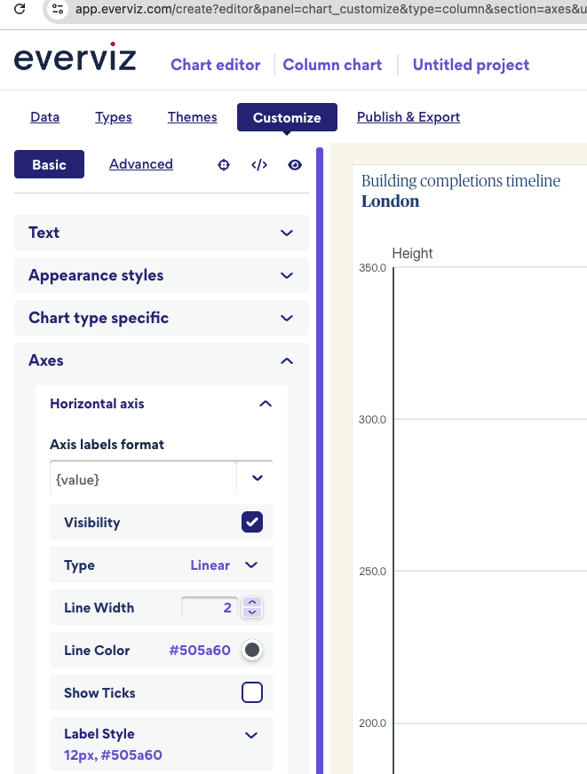
Regarding the X-axis year values, I can see that it is currently set to Linear , and all years are not displayed on the chart. Would you like to display more fewer years? Please let me know.
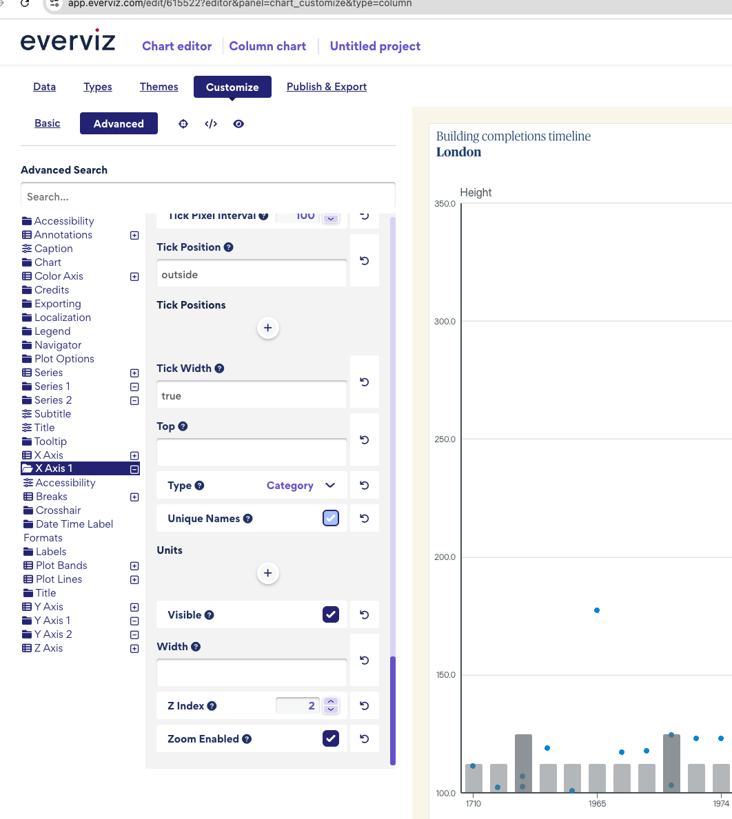
Hi @far Yeah I’ve got it set to linear, because if I set it to category, I’ll have multiple years. but yes i’d like to display fewer years (only the years I have data for)
Regarding the X-axis data issue, it would be helpful if you could publish the latest version of the chart and share the public link with me so I can investigate further. It looks like it may be related to a column assignment issue. Could you please check which column is assigned as the category in the data section? It should be set to the year column.
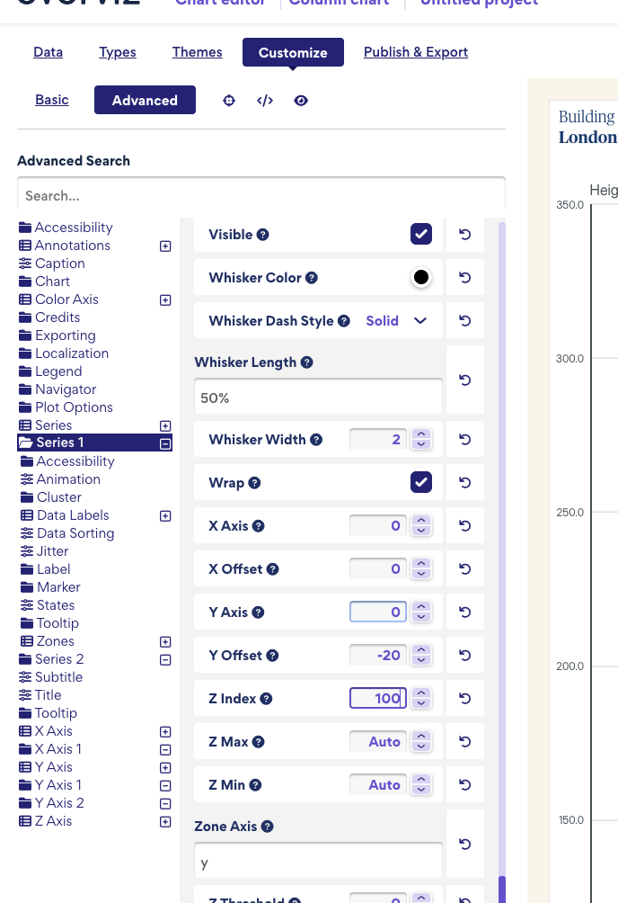
If you want to keep the “completions” series always behind the other series, you can adjust the z-index. Go to Customize → Advanced → Series 1(select the specific series you want to display in front) and set the z-index to a higher value, such as 100.
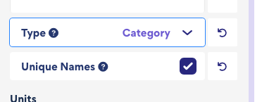
I can see the issue in the published chart now. The problem occurs when the x-axis type is set to category and there is a column named Name. Highcharts, by default, uses the Name column as the category labels.
To fix this, you can rename the Name column to something else, like Building Name. This should resolve the issue.