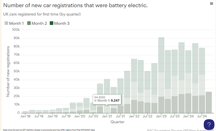
I have a chart where the columns are in quarters but the axis tick/label is being set to the next month along
e.g. (as in plot below) the column representing Q4 2020 is sited above an axis tick for Jan 21.
Does anyone have an idea how to amend this?
Thanks,
Tim
Hi again Rac Foundation
This looks to be related to the issue we discussed earlier.
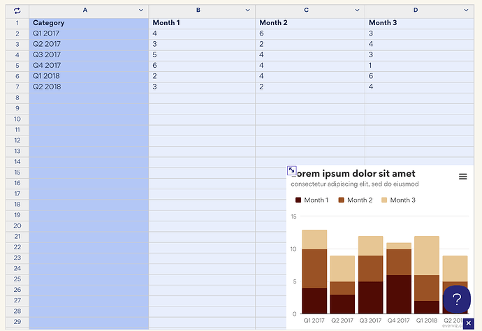
My recommendation is to simply use quarters in the data instead of dates. This way you don’t have to customize the chart to render the tooltips and axis labels as quarters
Here’s a PoC
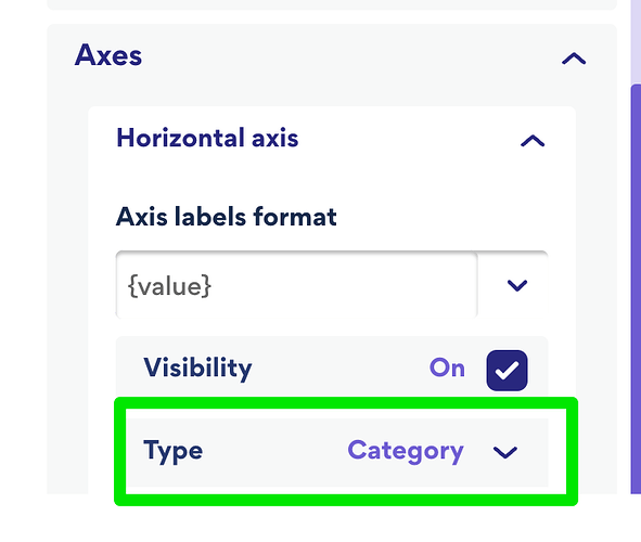
In this case, you need to use Category as Axis type on the horizontal axis
Hope this helps
Cheers,
Havard


