Hi,
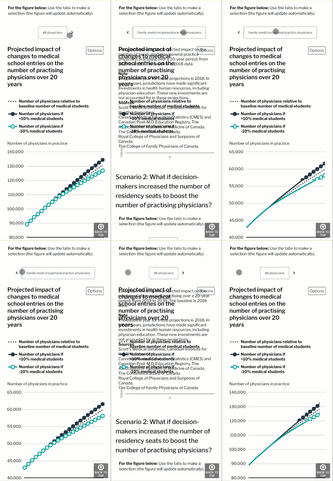
We have noticed when there are 3 tabs in our tab layout there is a dark separator line (Border color) which distinguishes more than one “button”. If there are are only 2 tabs, that separator line disappears and it’s not clear that there is more than one “button”. In mobile view it it looks odd because it’s missing it’s border. This could be an issue for people with low vision. I realize we could always change our “active colour”, but our style with other charts on our site is using a light grey.
Is it possible to have the separator line true when there are 2 tabs?
Thanks!

![]()

