This is doable, but it will involve some advanced configuration as well as some custom code as this is a pretty complicated combo chart.
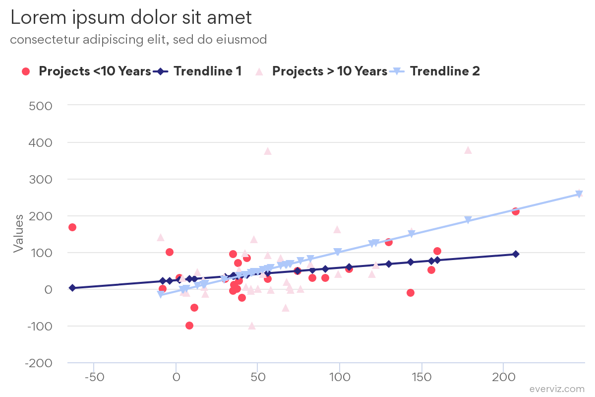
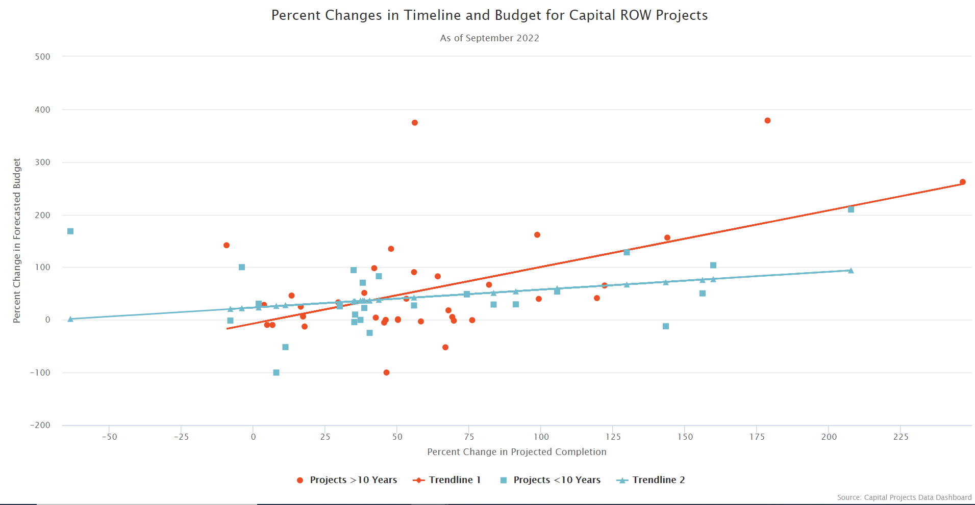
Here’s a preview of the final result:
If you want to go copy this chart your everviz account, you can open this link and hit save:
https://app.everviz.com/create?uuid=c6czROhmO
Steps involved creating this chart are shown below.
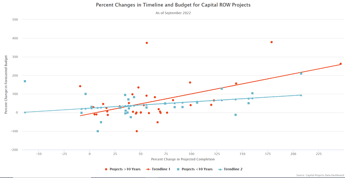
Step 1: Create the scatter chart
You should now see something like this:
Step 2: Correct the mapping of the different series
Disclaimer: This step may be a bit involved, but it’s required to overcome the complexity of the chart.
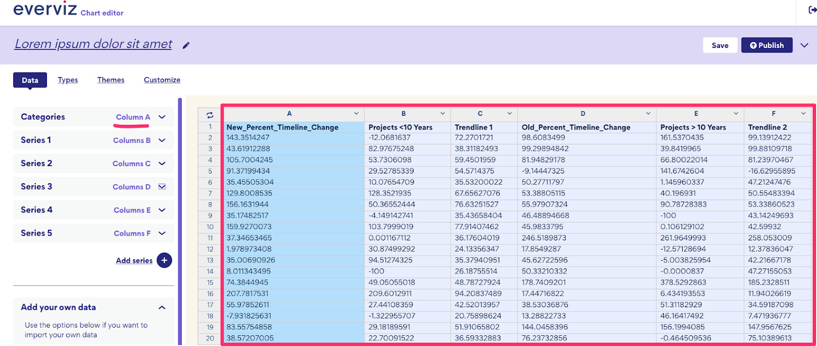
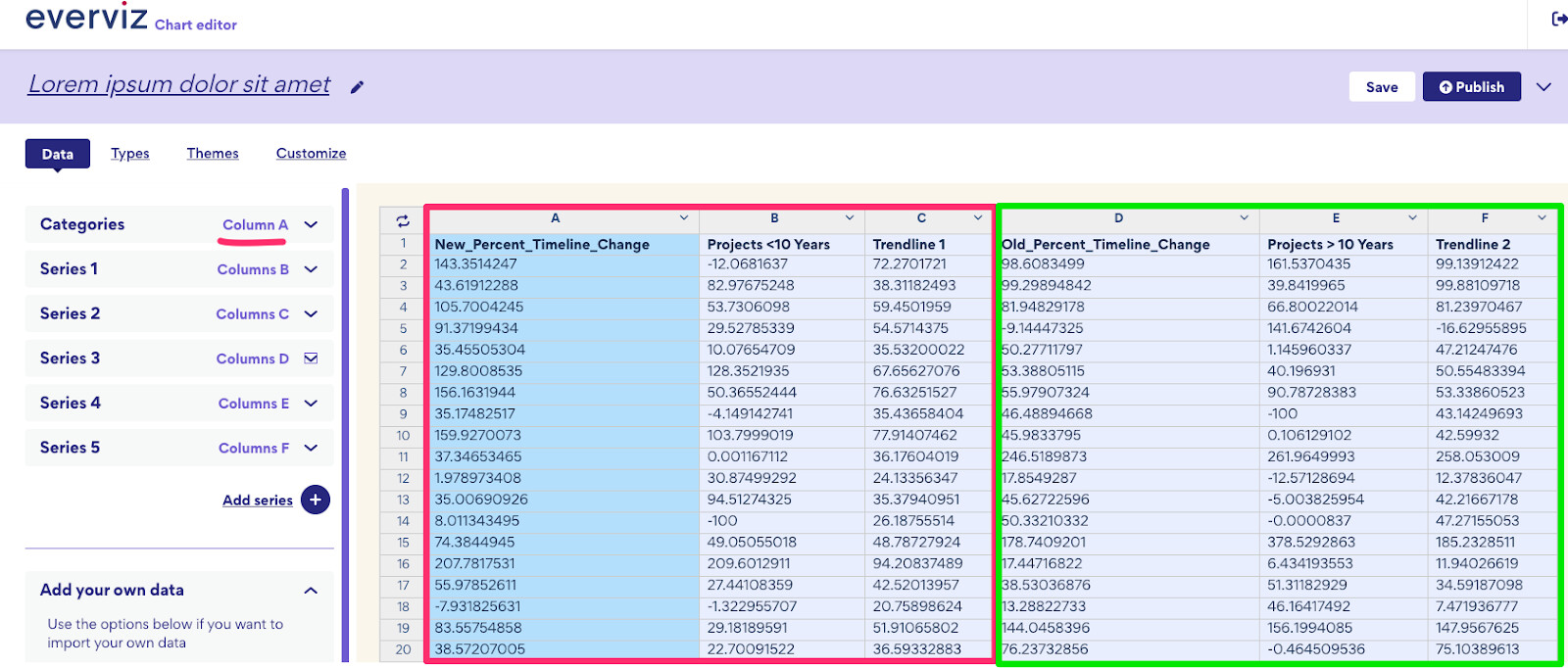
Go into the data view to see how data is mapped. You will see something like this:
Notice that all your series are connected to the categories in the first column(A) highlighted in red box.
Since you have the categories for the second scatter series and second line in Column D, we will have to do some changes to make this work. Your desired mapping will look like this:
This is doable, but requires some custom code:
Add the following to custom code:
Highcharts.merge(true, options, {
  data: {
    seriesMapping: [
      {
        x: 0, //First serie mapped to column A
        y: 1
      },
      {
        x: 0, //Second serie mapped to column A
        y: 2
      },
      {
        x: 0,
        y: 3
      },
      {
        x: 3, //Third serie mapped to column D
        y: 4
      },
      {
        x: 3, //Fourth serie mapped to column D
        y: 5
      }
    ]
  },
});
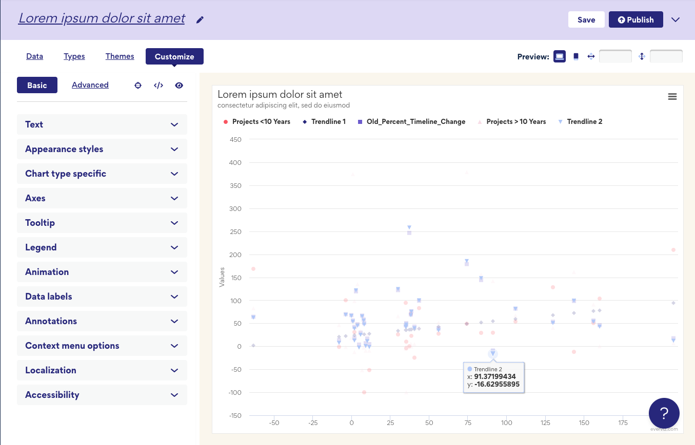
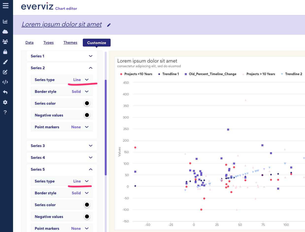
Step 3: Convert into a combo chart
Next step is to convert the chart into a combo chart. In other words, we would like some of the series to appear as lines instead of a scatter
Goto Basic configuration. Under chart type specific. Change Series 2 and Series 5 into a line
Our knowledge base has more information on how to create a combination chart.
Note: There seems to be an issue currently that the lines are not appearing.
You can fix this in Advanced configuration by going to
Series 2 > Line width. Change to desired width
You will do the same with Series 5 which is the other line.
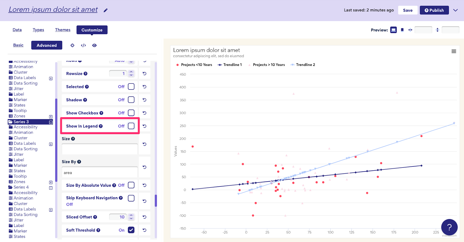
Last thing we need to do is to remove the series containing the second category from the chart.
Goto Advanced > Series 3
Set Visible to Off (unchecked)
And Show In Legend to Off (unchecked)
Hope this helps, and please comment if you have any further questions
Cheers!