The dropdown layout feature shows multiple charts in one view and to switch between them is easy as pie.
This is a great way to visualize multiple charts dealing with the same topic, for example answers to a survey question from different groups of people.
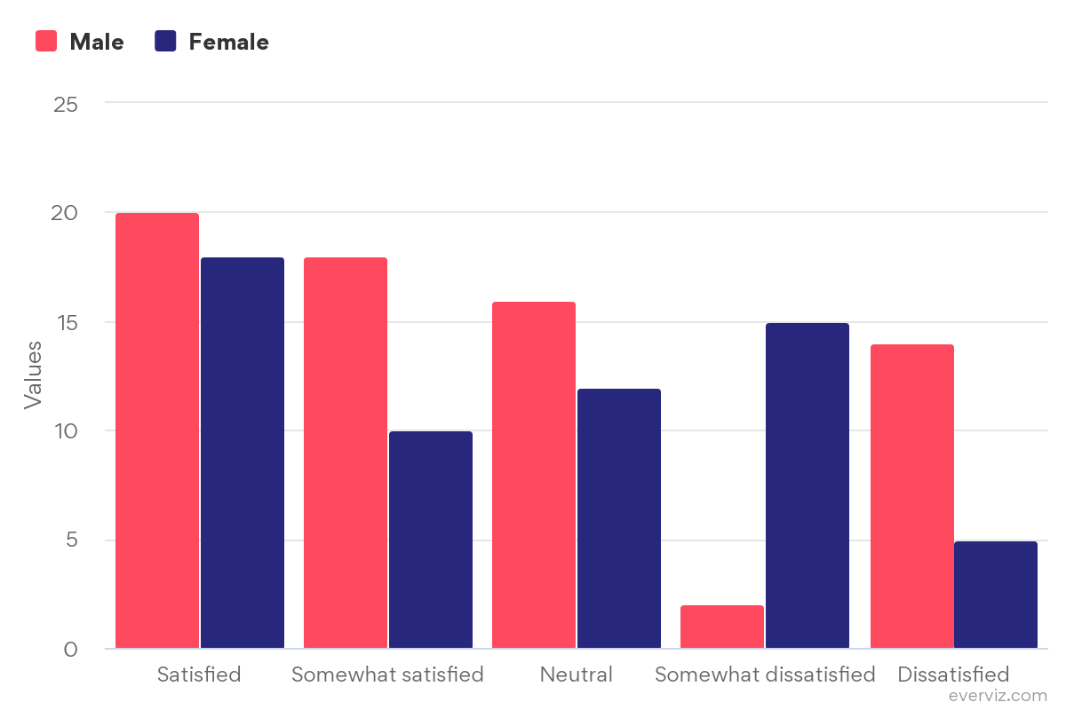
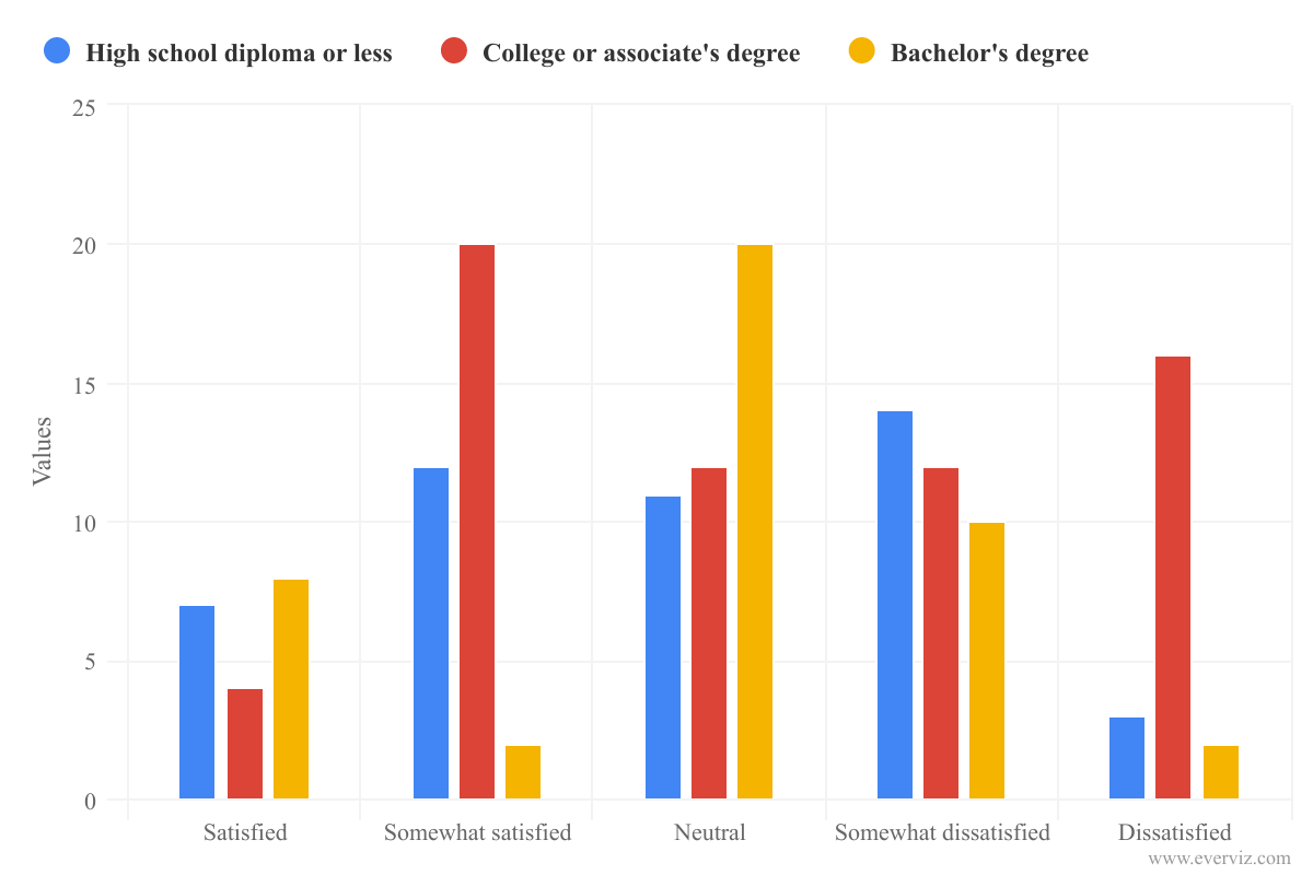
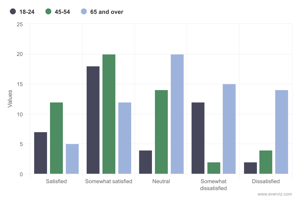
Now say you want to visualize the answer to the question ‘How satisfied are you with healthcare in your region?’ based on three categories - age, gender and education.
Here, we created three separate column charts. Notice each category has a unique color profile, helping the reader distinguish between the content. Feel free to reuse these charts to try this yourself.
Now we are ready to add the charts into the dropdown layout element.
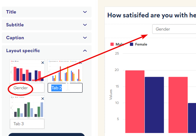
To create the layout:
- Click the layout project type
- Select the Dropdown type and add your first column chart
- Cycle through the layout wizard, adding branding and text elements, including a title, ‘How satisfied are you with healthcare in your region?’
- On step 4 click Continue in editor
- Under Customize > Layout specific click Add visualization and add the other two charts
- Rename the tabs
And here is the final result: three column charts - one each for answers by gender, education and age - in one view.