Thanks for reaching out about this 
Our themes are set up with every option we are able to implement (Accessibility, Marker styles, Options button, X-axis and Y-axis (title, gridline styles, etc.).
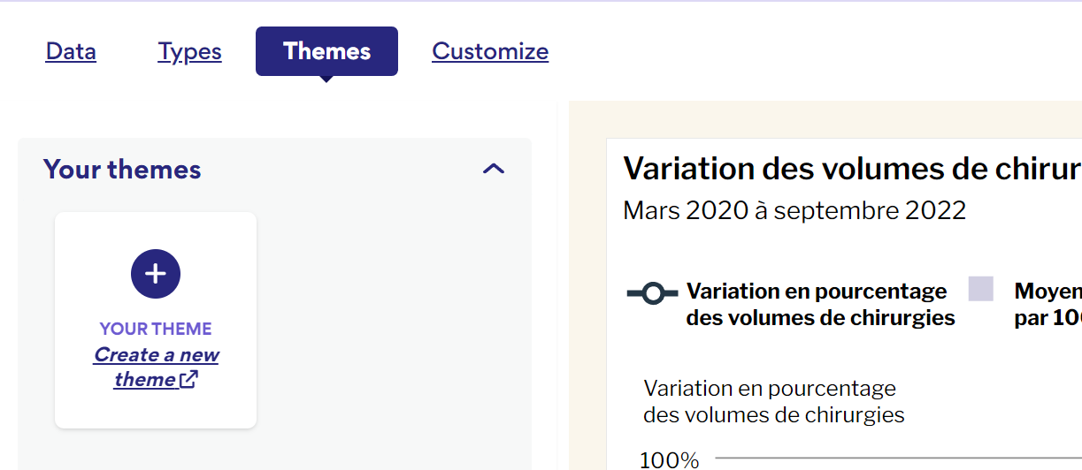
We also have different themes depending on the type of chart. For example, we use different colours for our line charts than we use for bar charts, but everything else remains the same.
The idea is that we don’t want to have to change anything, or barely anything, once the theme is applied.
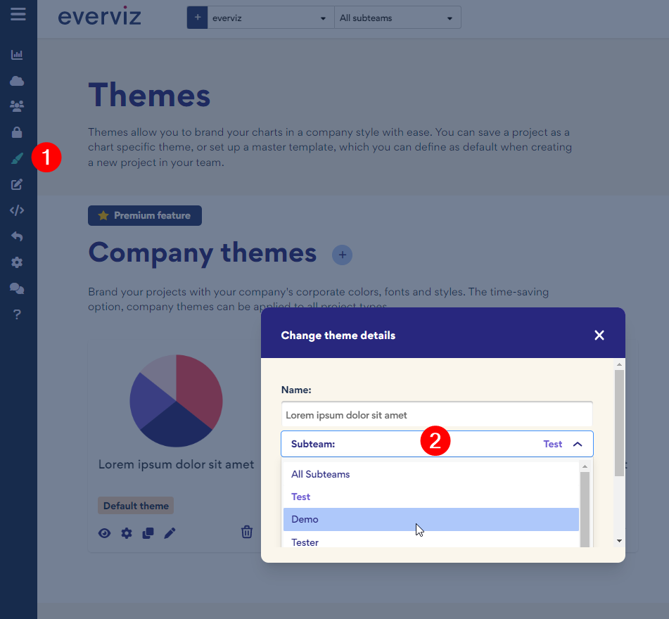
It’s great that the company theme sets the colours, titles and captions, but it’s very limited and because of this, we still end up adding a “project theme” to our charts. So it’s not actually saving us time in the end.
As for using Subteams vs Tagging.
We are open to finding better ways for organizing our charts, but it’s a bit complicated.
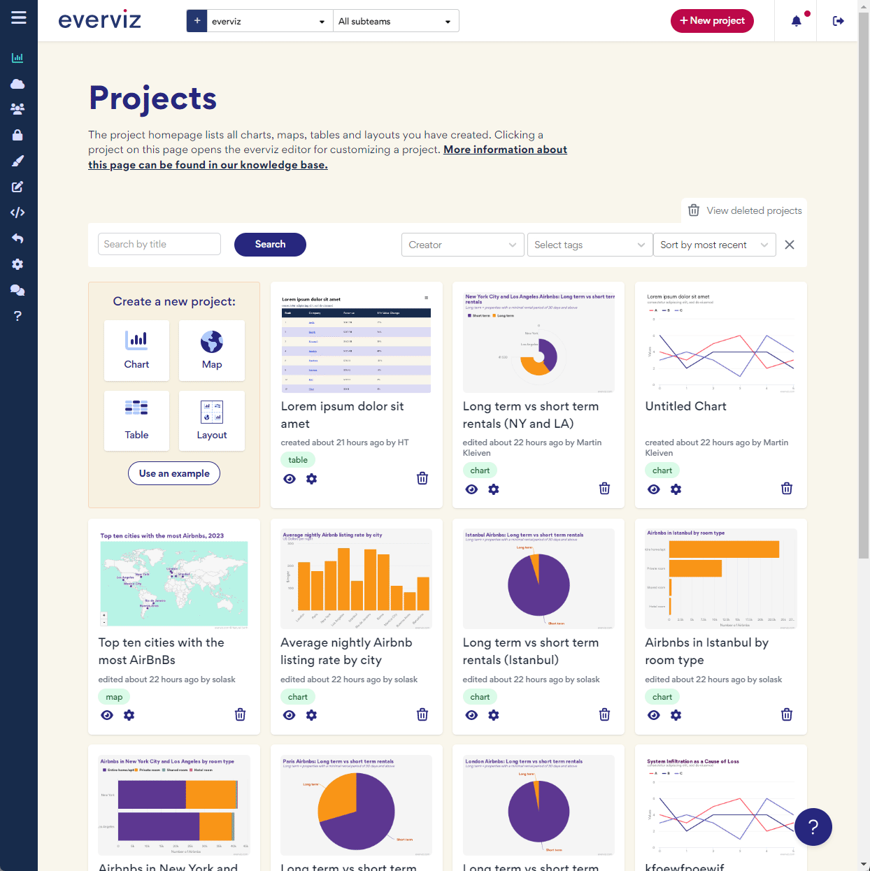
All of our projects have specific numbers and titles associated with them, for example: 31279 EN/FR - HHR Maps Data and Titles. Within these projects there could be up to 70 charts (we always have both English and French charts) and named Fig01 to Fig04. The Fig01 might then have 10 charts associated with it (our provinces, 20 if you include both languages). The best way at keeping these organized was using Subteams and then adding tags (EN, FR, Fig01, Fig02 etc.) But even this isn’t great because you can only search using 1 tag at a time. Once you edited the chart and then went back to edit another, the tag would disappear and you would have to reapply the tag again.
It’s tricky because we have different layers of organization that is required. It might be easier if we showed you at the next meeting.