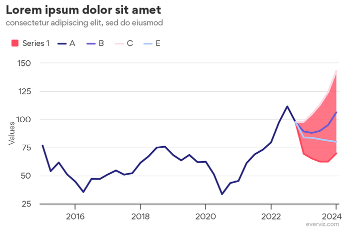
The following example is from a prior customer discussion where we wanted to to write labels as concisely as possible.
Per now this assumes that dates are formatted as:
dd/mm/yyyy.
You can adjust the interval of the labels shown by changing the value of interval in the code. It is possible to adjust this to show different amounts of labels with our responsive rules. A better long-term solution is to automatically hide any colliding labels. If there’s interest in this, I’ll see if we can do that.
Here’s the custom code:
var month = 24 * 3600 * 1000 * 31
var interval = 6
var nLetters = 3

Highcharts.merge(true, options, {
  data: {
    dateFormat: "mm/dd/YYYY"
  },
  xAxis: {
    tickInterval: month * interval,
    type: 'datetime',
    labels: {
      autoRotation: false,
      formatter: function () {
        var d = new Date(this.value);
        var f = Highcharts.dateFormat
        if (d.getUTCMonth() == 0 || this.isFirst) {
          return '<b>' + f("%b", d).slice(0, nLetters) + ' ' + f("%y", d) + '</b>';
        } else {
          return f("%b", d).slice(0, nLetters)
        }
      }
    }
  }
})
