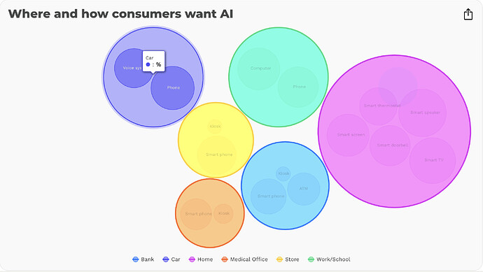
Hovering over an individual bubble works as intended, displaying the ● {key}: {y}%.
However, when I hover over the grouped series bubble, because the series have no key or y values, only the ● : % is displayed, which looks like a mistake.
I understand that each series does not have the data required to populate this information, but am looking for a solution to avoid this rendering issue.
Is it possible to hide the tooltip, only when hovering over the series groups? Or possibly to manually enter a key and y value for each series?
