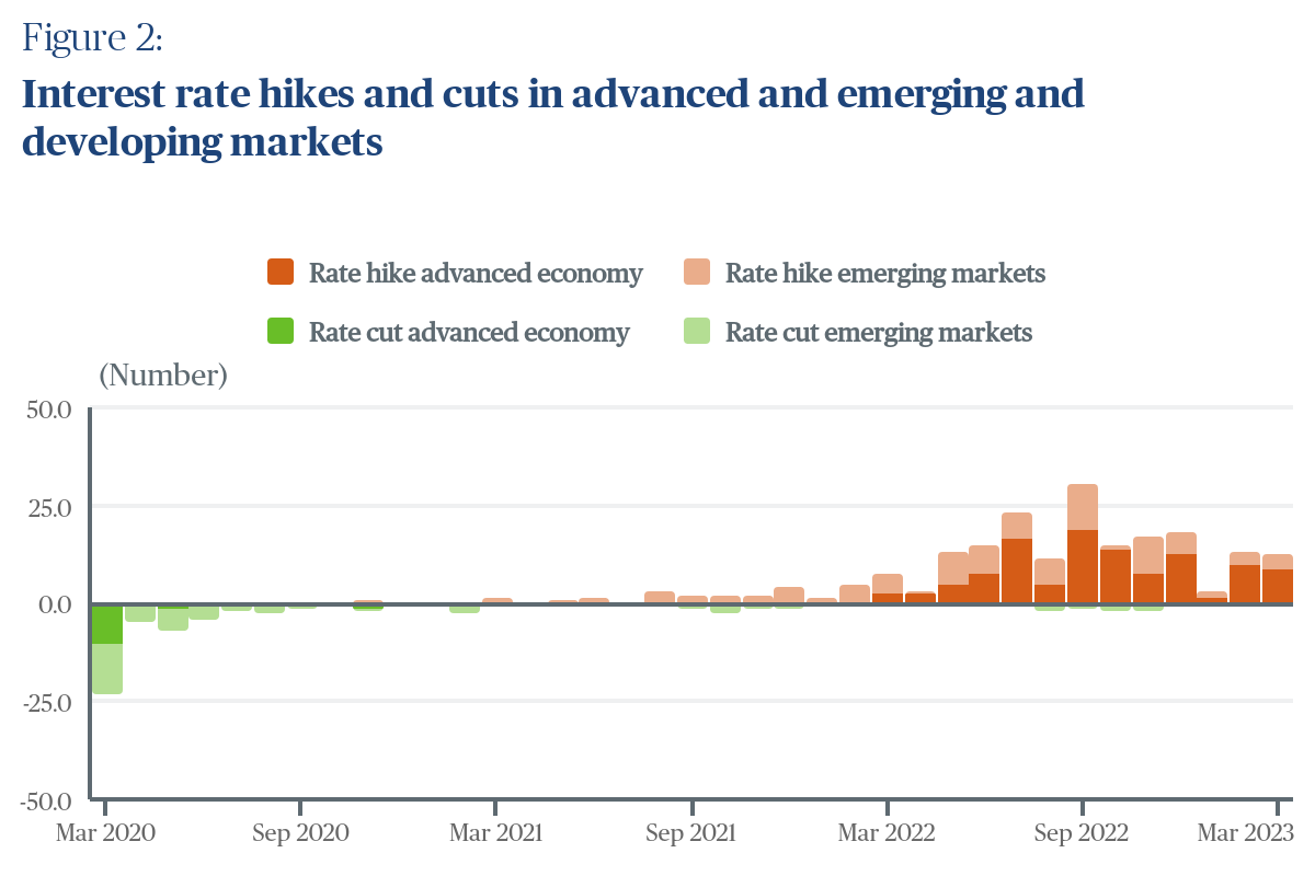
Here’s my chart
Here’s my problem
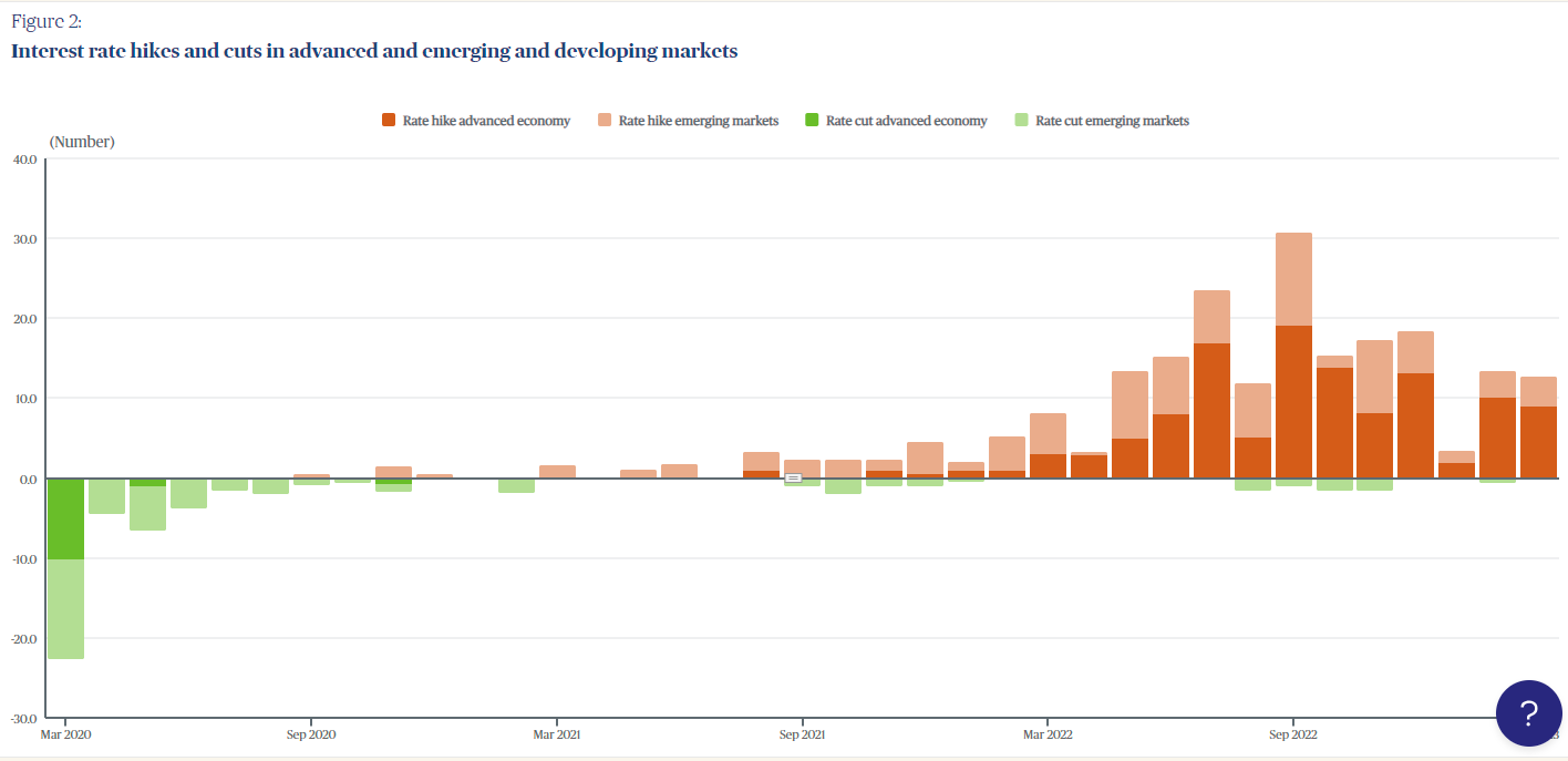
My chart (only when embedded) shows the darker coloured series (Rate hike advanced economy & Rate cut emerging economy) further away from my 0 line, however when making changes to my chart, the everviz editor shows the opposite
I’m looking for a solution that forces those particular series to appear closer to my 0 line
Please
Hi Chris,
It seems like the default behaviour is categories with larger values appear at the top of a stacked column (or on the bottom for negative values).
So this default sorting is what you want to have control over, correct?
Beautiful chart btw!
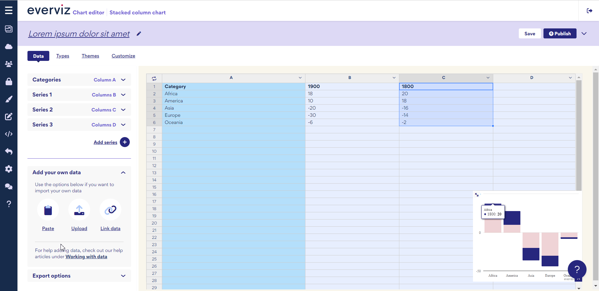
Hi again Chris,
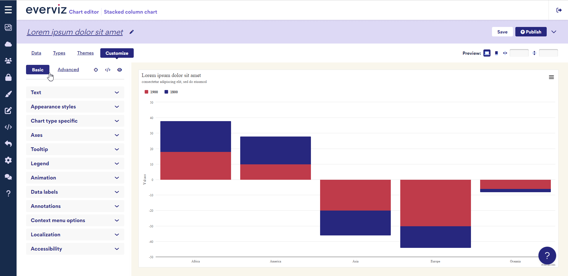
So go to Advanced customize → YAxis 1 → Reversed Stacks = turn on and off again and then republish.
Worked like a treat, thanks @Mark