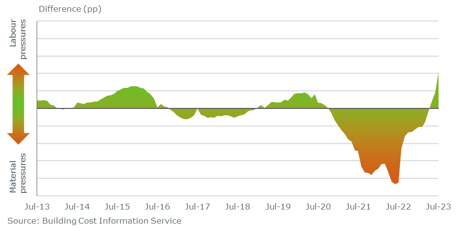
Not sure if this is possible or more of a feature request, but i’m looking to achieve the below
in this instance, the higher the pressure, the more the colour should be darker.
not sure if its possible in a negative area chart, or a negative line chart may be my best option.
kluvin
September 4, 2023, 4:34pm
2
Hello!
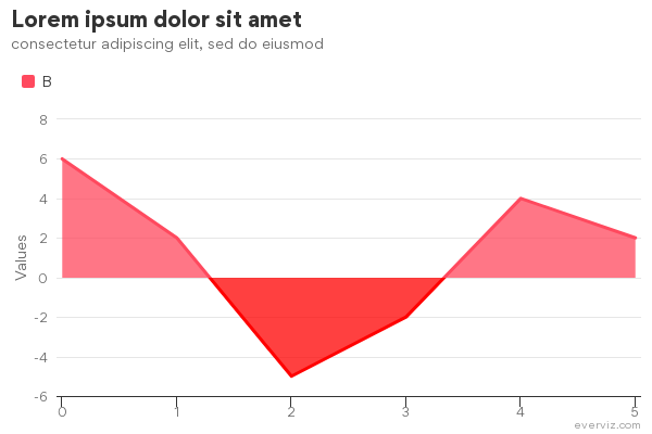
Here is a very barebones example:
Using custom code:
Highcharts.merge(true, options, {
  plotOptions: {
    area: {
      fillColor: {
        linearGradient: {
          x1: 0,
          y1: 0,
          x2: 0,
          y2: 1
        },
        stops: [
          [0, 'orange'],
          [0.5, 'green'],
          [1, 'orange'],
        ]
      },
    }
  },
})```
1 Like
Thanks @kluvin tweaked it slightly, looks great
1 Like
kluvin
September 5, 2023, 11:30am
4
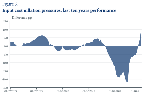
Hi Chris
You can get closer to the original gradient by increasing the domain of the green color.
For example, update stops to:
        stops: [
          [0, 'orange'],
          [0.4, 'green'],
          [0.5, 'very green'],
          [0.6, 'green'],
          [1, 'orange'],
        ]
1 Like
Mark
September 5, 2023, 11:44am
5
Loving that chart, Chris!
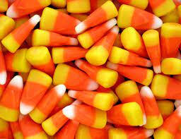
It reminds me of this candy
I’ve had to adjust it by eye, as the strongest of the green colour needs to be at my zero line, rather than halfway between the top and bottom of the series area.
Originally, with 3 stops
0, orange 0.5, green 1, orange
the 0.5 green hovered around the -5.0 mark on my axis
kluvin
September 5, 2023, 12:16pm
7
Interesting. 0.5 is meant to be halfway, but it seems off even when setting Y between 25 and -25
It’s in either case a bit tricky to reproduce your original chart without the numbers used for the gradient and axis