Mark
February 7, 2023, 11:47am
1
Highlight the zero line to help the reader distinguish between positive and negative values.
Go from this:
To this:
To highlight the zero line in a chart:
Go to Customize > Basic > Annotations
Under Lines click +
The plot area is highlighted. Click anywhere to start your line.
Click and drag the white circle with a black outline to set the length of your line
Drag the line to the 0 line
Under Size select a value, e.g. 2 or 3, to set the line width
To highlight the zero line in a chart:
If your line is the full length of your chart, you can also use a plot line instead of an annotation.
Go to Customize > Advanced > Y axis
On Plot Lines, click +
Under Plot Lines 1 you can change the color, dash style, value, line width and z Index
1 Like
kluvin
March 2, 2023, 9:00pm
3
Hi Kerry! Nice to see you on here, finally!
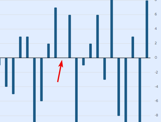
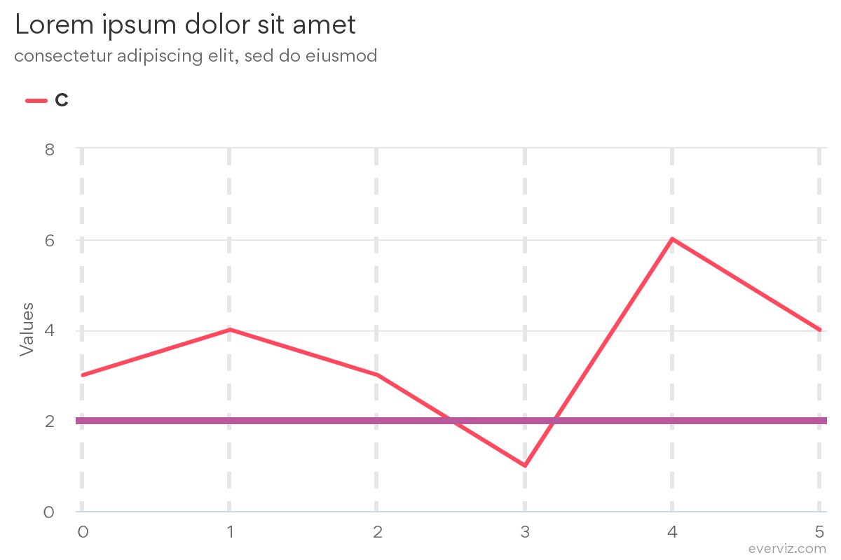
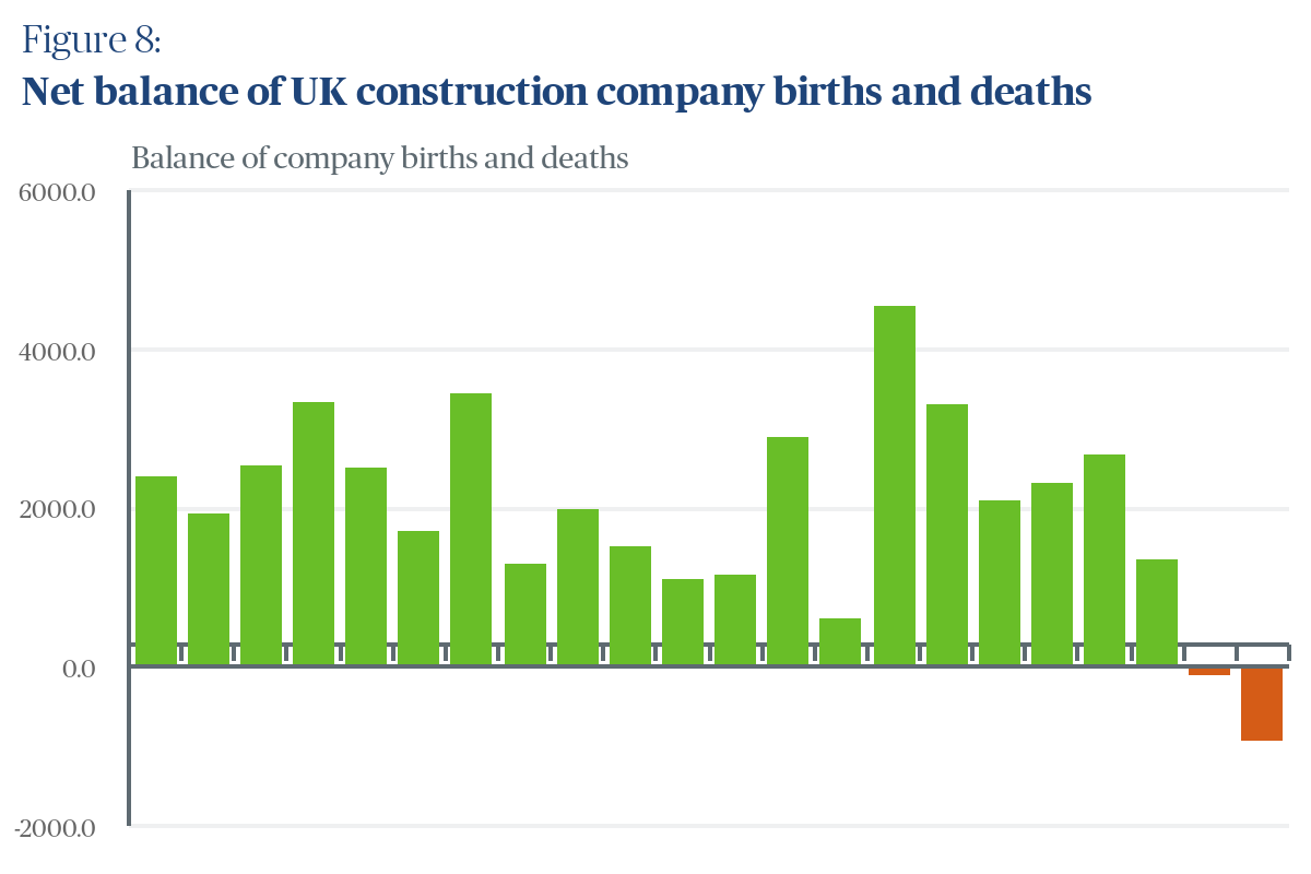
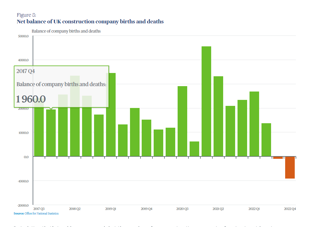
I definitely prefer this solution, as it allows one to be absolutely sure about the plot line covering exactly the value one desires (in this case x=0)
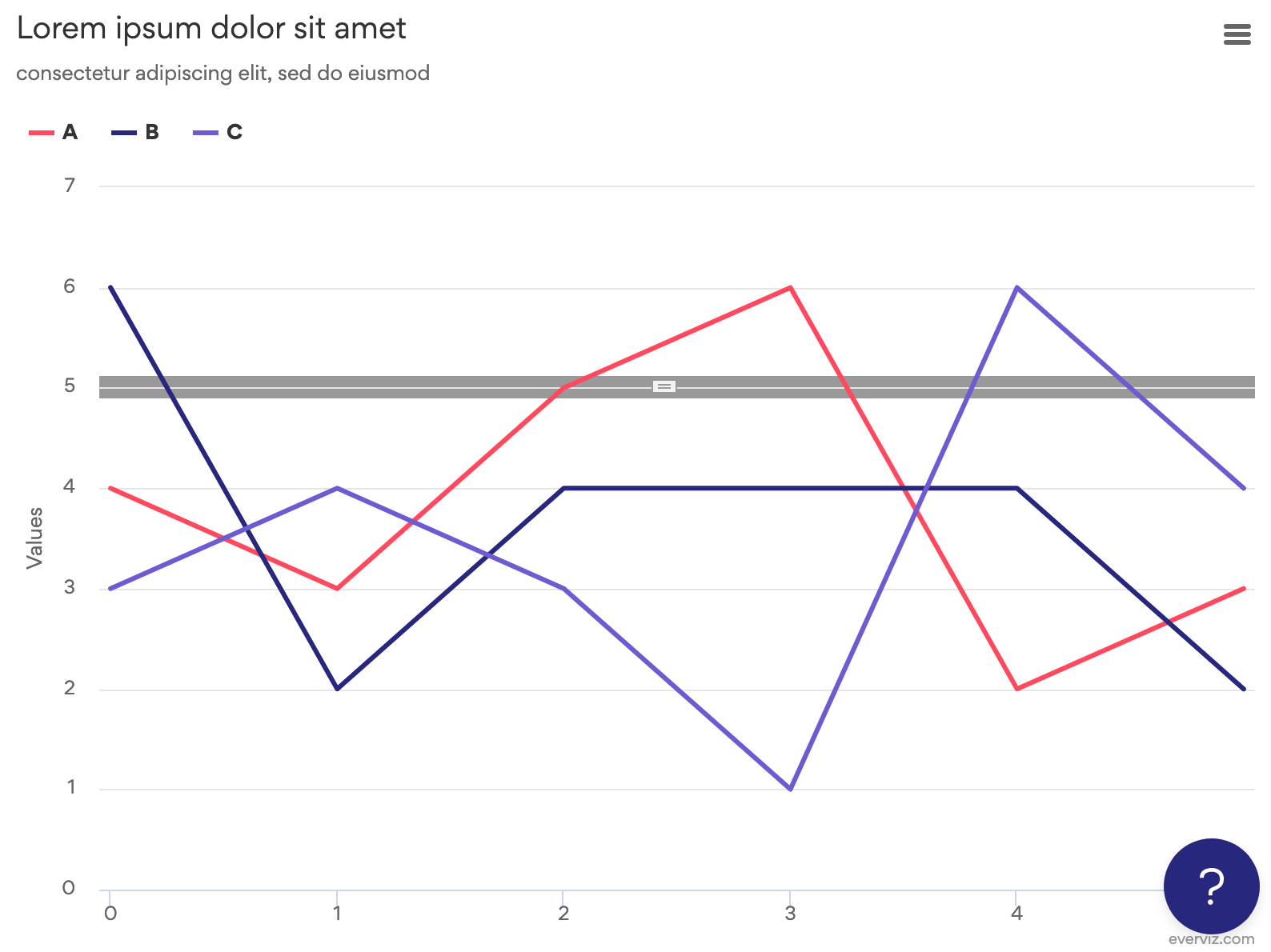
The Z index is of course important, because artifacts like the grid line showing here in white:
And we might want to make that Z index a default behavior. But I can’t say for sure before we get to investigating if there are any trade-offs.
1 Like
to follow up on this, is it possible to have my tick marks on my zero (0) line?
hopefully the screenshot provides further explanation
kluvin
March 22, 2023, 4:04pm
5
Hi,
I am not aware of any way of doing this. It might be possible by defining an extra axis and using that as your would-be plot line.
On the other hand, you can add gridlines to the horizontal axis, although your lines will cover the entire vertical span at that point:
You can set this by going to X Axis [1], and adjusting the “Grid line width”.
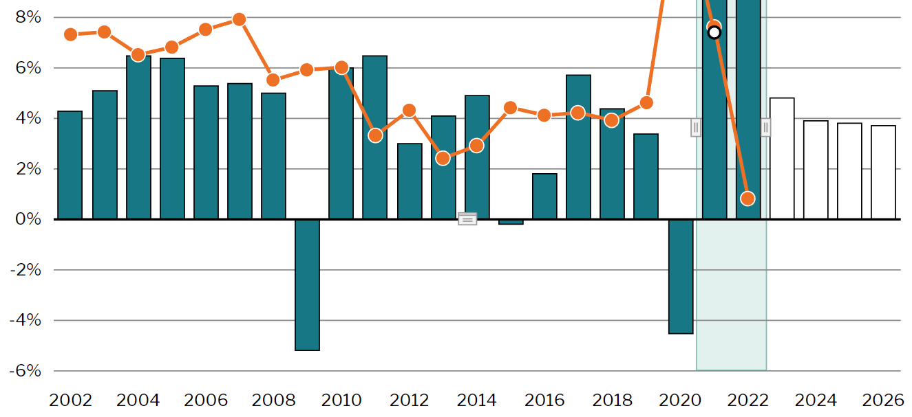
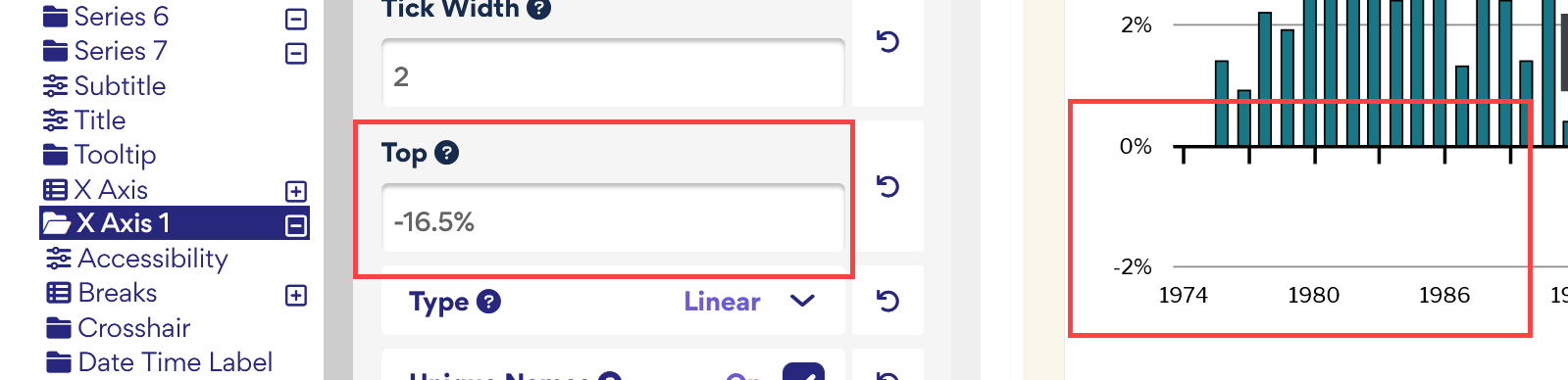
You could try changing the Top position of your x-axis to a percentage (if you use a number instead of a percentage it seems to change positions when responsive).
Then, if you want your labels to stay at the bottom, you could change the Y position of those.
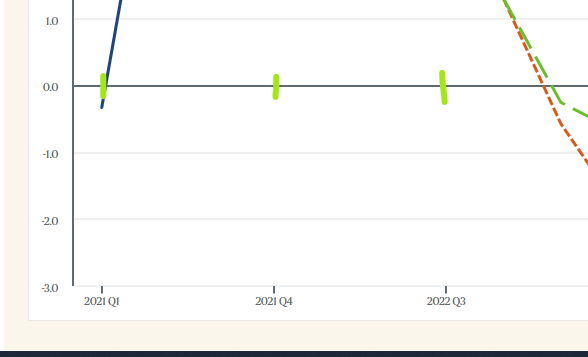