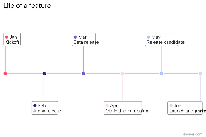
The timeline chart is awesome for visuzlating a series of events, like here showing the steps to releasing a new feature in a software program:
Each event is described in a box branching off a line. When the box contains a lot of text it can sometimes crowd the line.
The fix is to move the position of the boxes.
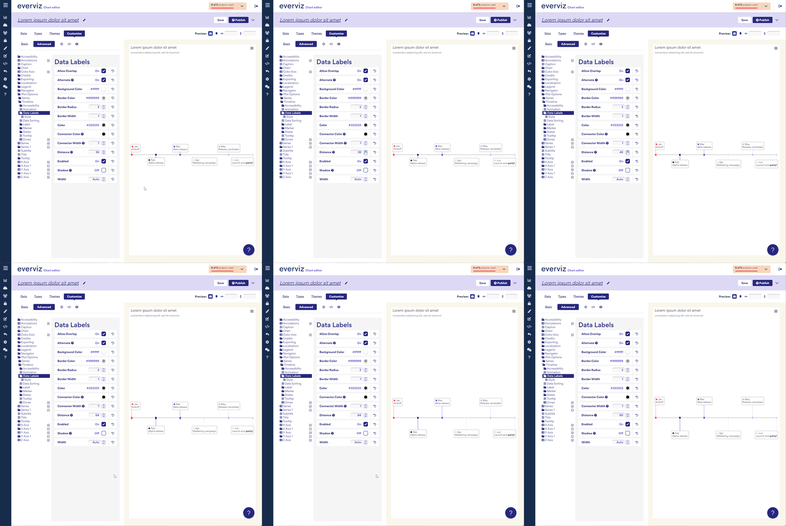
This can currently be changed under Advanced customize → Plot options → Timeline → Data Labels → Distance, as shown here:

