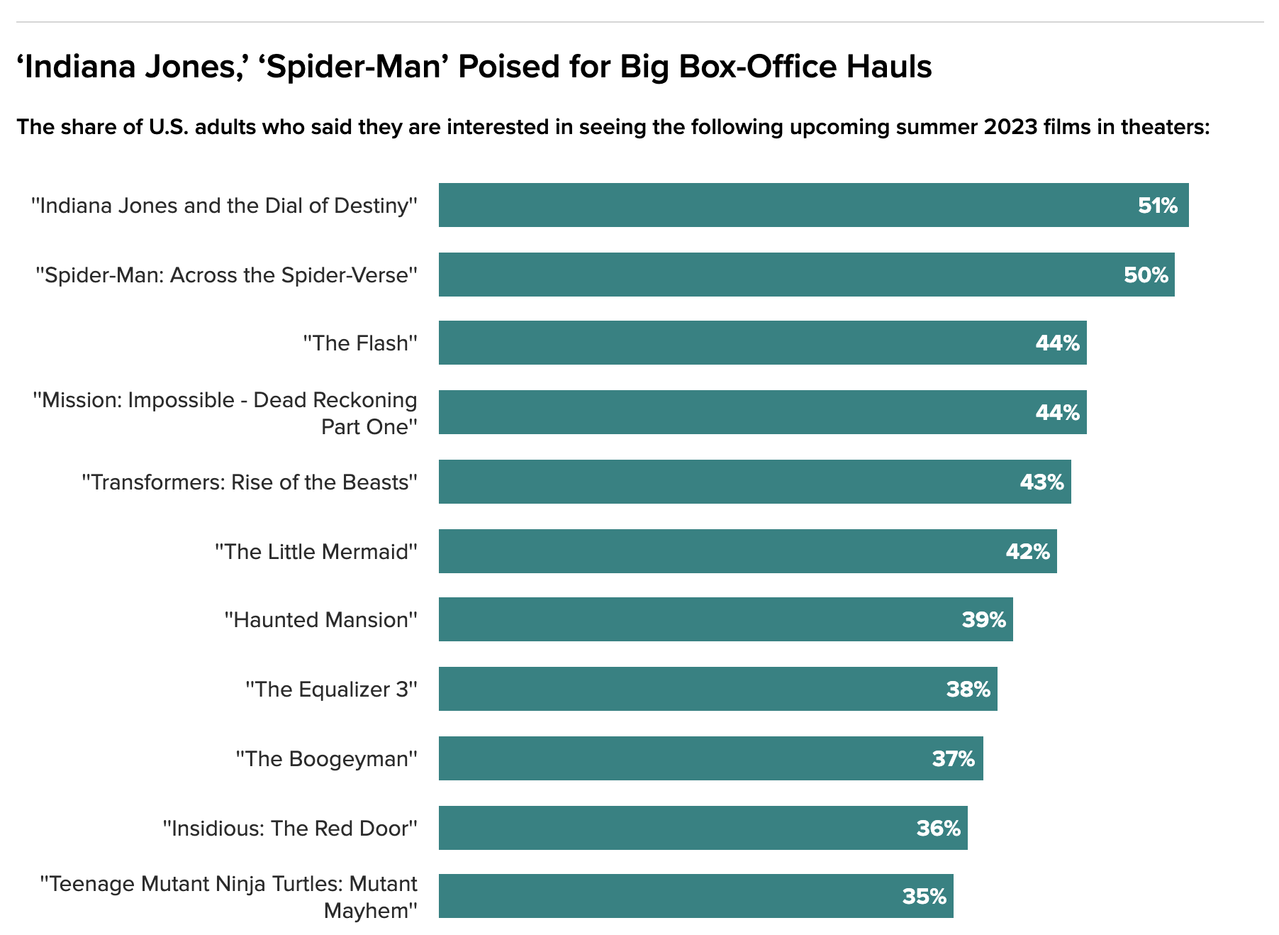
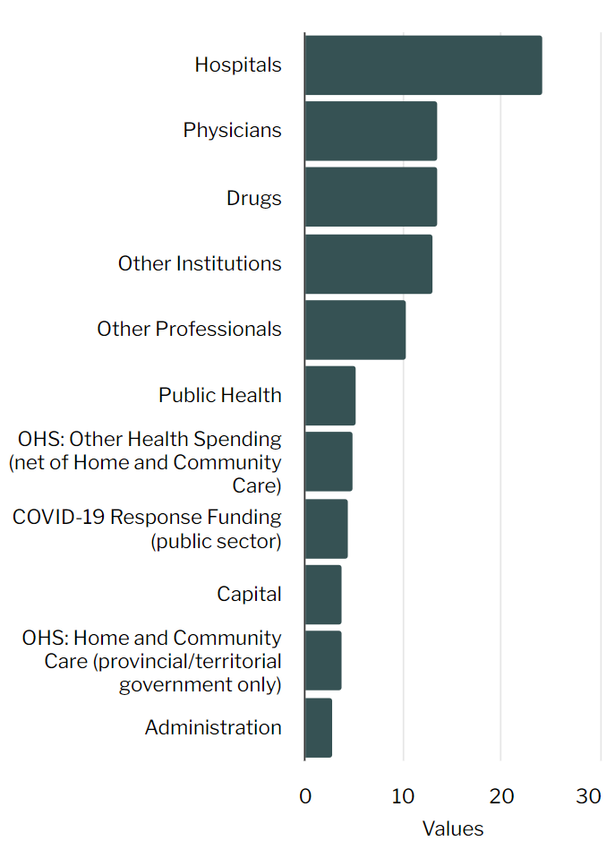
Hi! We often have users create charts with long text labels (screenshot as example). To ensure those labels don’t get cut off for desktop and mobile, we end up extending the height of the chart (often double the height, or more, of a chart set to Auto). Under Advanced, I found a “Width” field for the X-axis (which is the category axis in the screenshot). But when I set it to 50% or 75%, nothing changes. Is there another setting that could help me? Or is that the correct one and it’s just not working?
Hello Sam,
If I understand your question correctly:
We had a different customer who asked this and we came up with a solution.
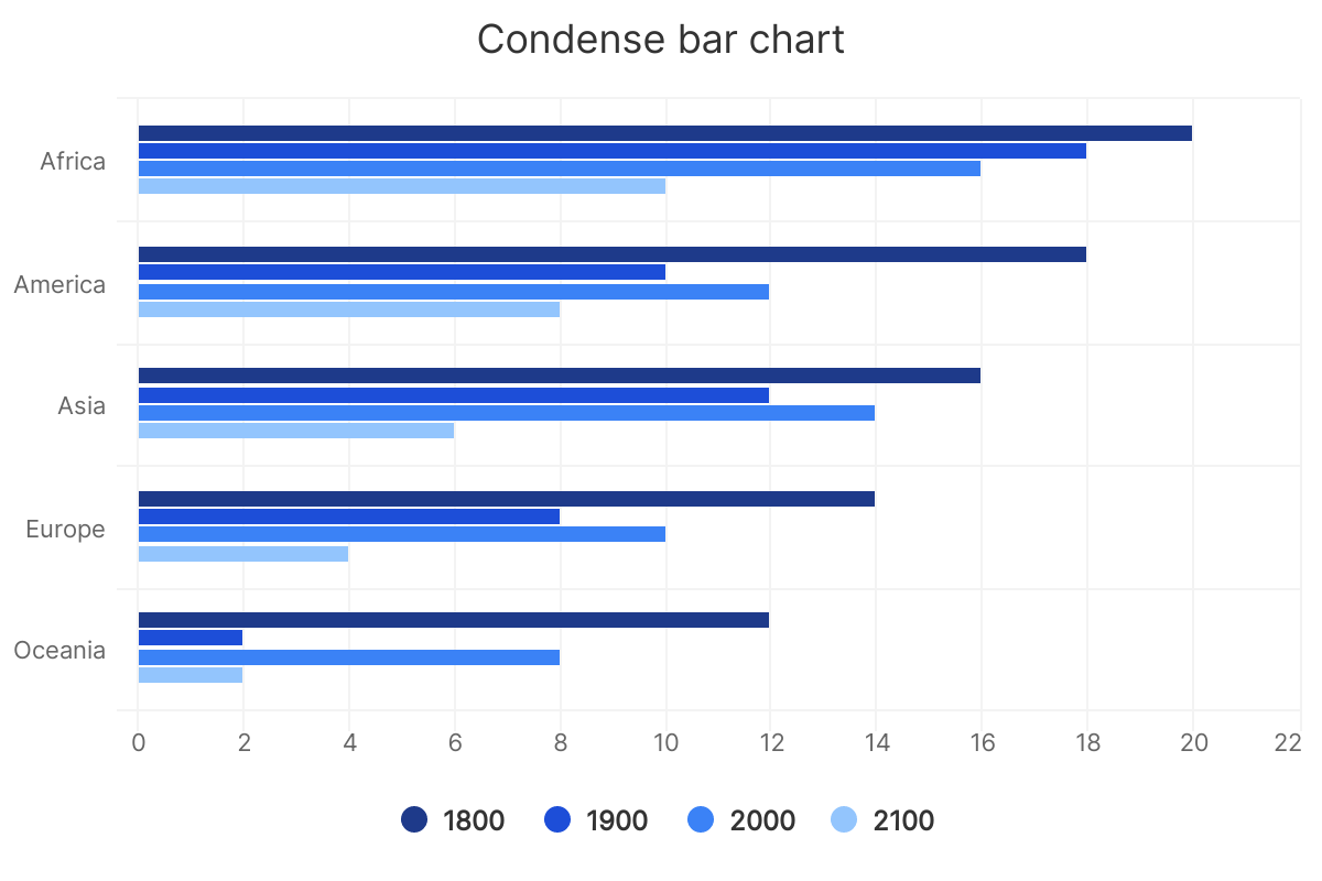
One small change I’d like here is to get a bit more separation between the title and the preceding group. For instance, does the title “Asia” belong to the graphs above or below? Not immediately apparent to me. If we could solve this I think this is a behavior we could make default for smaller screen sizes, where it really matters.
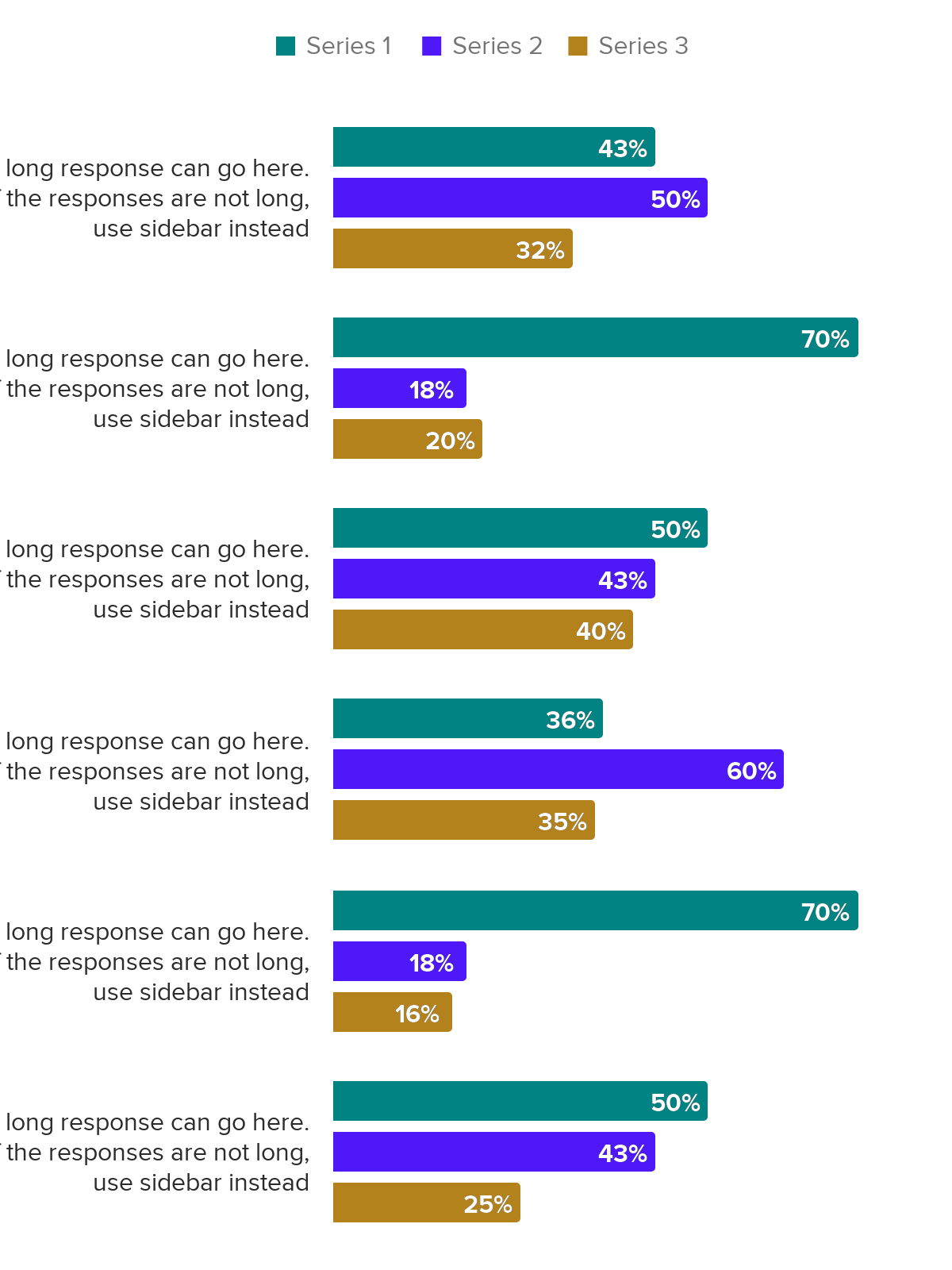
I am not sure that the setting you refer to affects what you hope for. I can investigate if it is possible to introduce some wrapping, such that the longer titles would more lines. However, this introduces an issue where in some cases a line will still be long, and now then we have to deal with how the bars look and are spaced as a result.
Hi Martin,
This is helpful! It’s not the fix I was looking for, but this could definitely help us (especially on mobile) if it were a setting we could choose. I was originally asking for a way to increase the width of the axis, which would make the bars shorter but provide more space for long text labels.
We’ve tried your solution in the past, but like you mentioned, we ran into the issue where it wasn’t obvious if the text labels went with the bars above it or below it. Here’s our example:
Hi Sam
You can set the max for the Y axis^1:
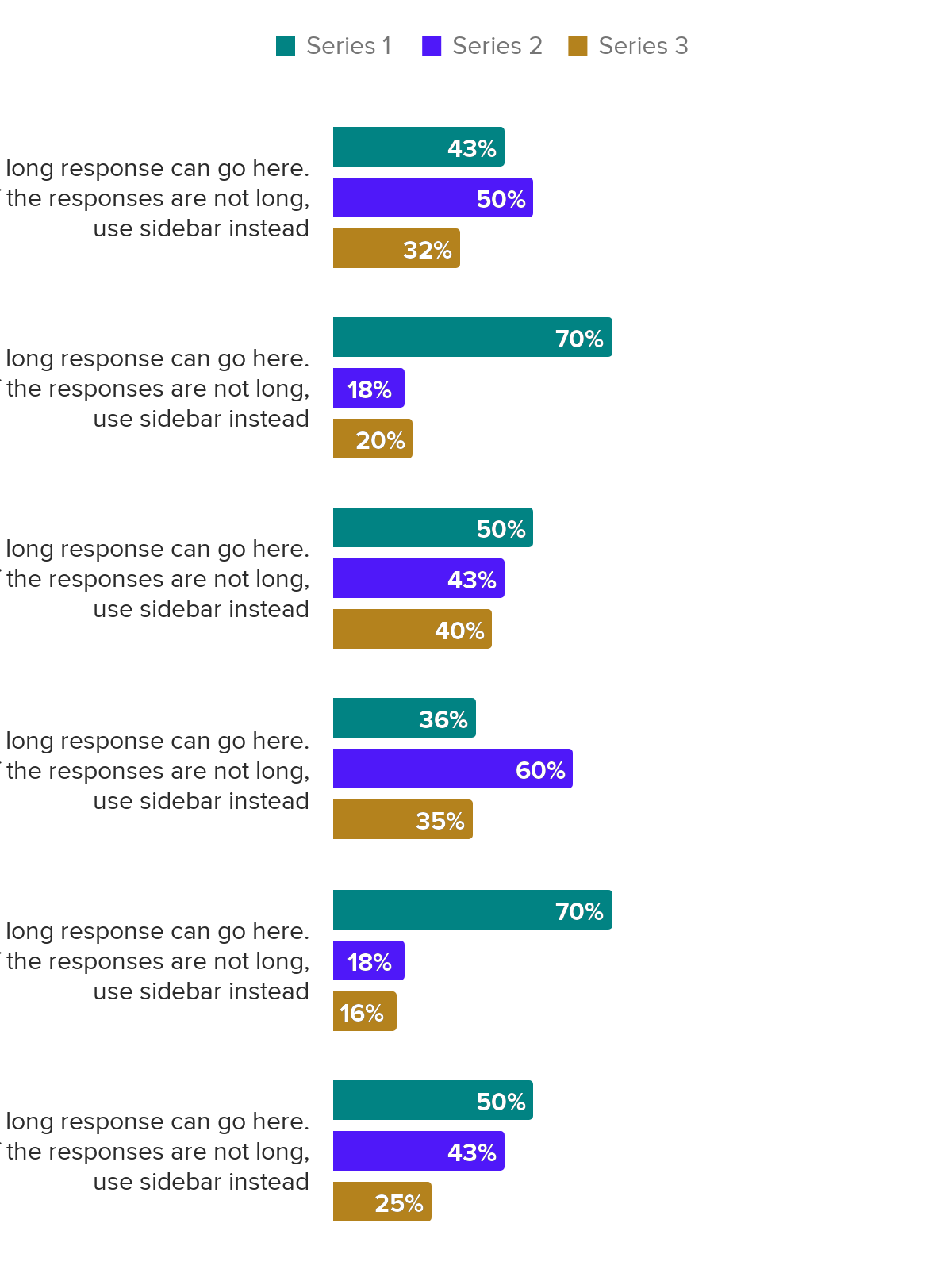
Compare that with not adjusting the max:
However, this does not yield the space to the labels. I’l need to think a bit, but I believe I understand your question.
- I admit it does not make sense that the X axes is changing instead, we’re in the process of fixing that
Hi,
I think it was me who was originally looking for this solution as well ![]()
I thought I would try and take another stab at it and found this code which actually seems to work. Then just adjust the width to the number you wish.
Highcharts.merge(true, options, {
    xAxis: {
        labels: {
            style:{
                width:'175px'
            }
        }
    }
});
2 Likes
Hi Kerry,
Yes this is exactly what I was looking for! I’ve tried it out on a test chart (using a % value instead of a fixed pixel width) and it’s working out well in combination with overall chart height. One thing: for mobile/responsive, I have to set a different, separate value so that it still looks proportional. Thank you so much!
2 Likes